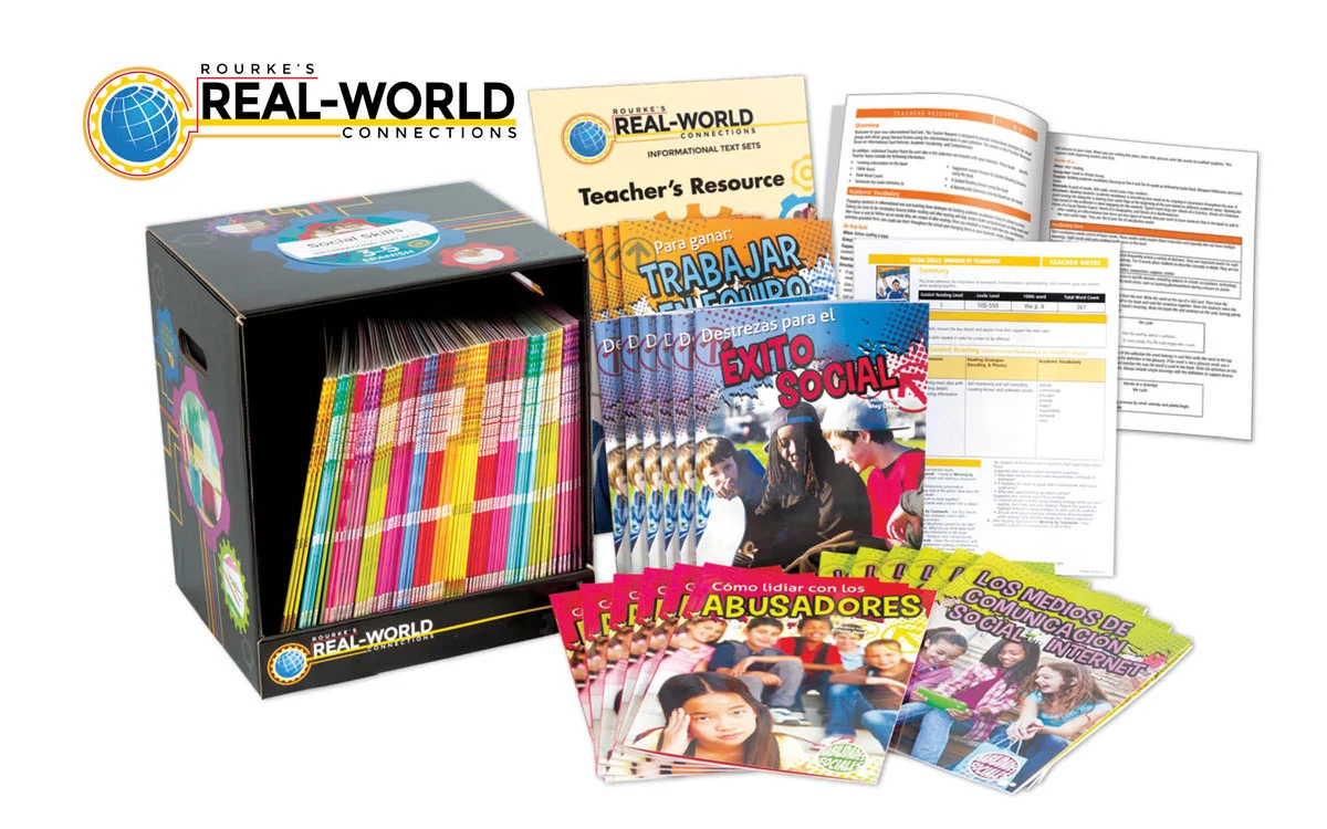
This is a package design I did last year. I was able to play with the concept off the name of the program, Real-World Connections. The idea was to design a generic box that could be used for several different subjects and different book packages. I used the gears to represent each of the different subjects and the colorful lines connecting them together. We then designed stickers to show the difference for each of the packages.
I also directed the photo shoot for the different products. Here are a couple different angles of the box.
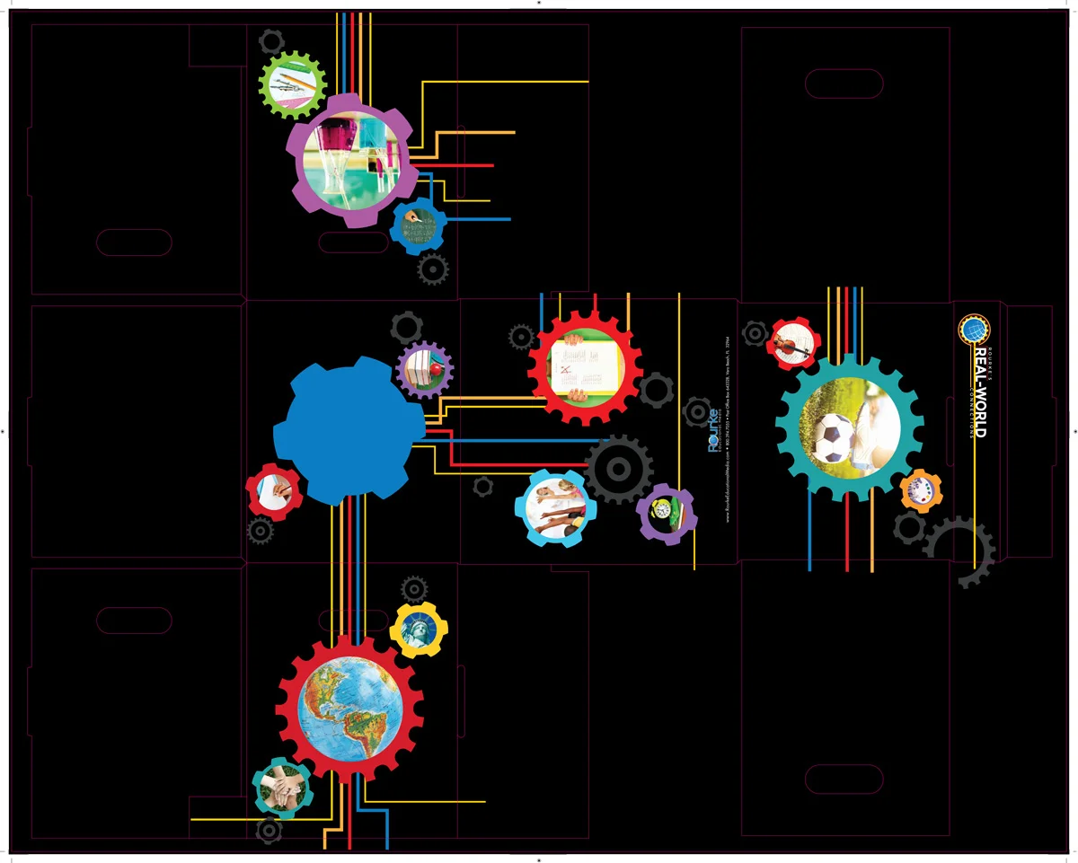
This is the design flat with the die-lines included. I really enjoy seeing the final product come together after designing flat.
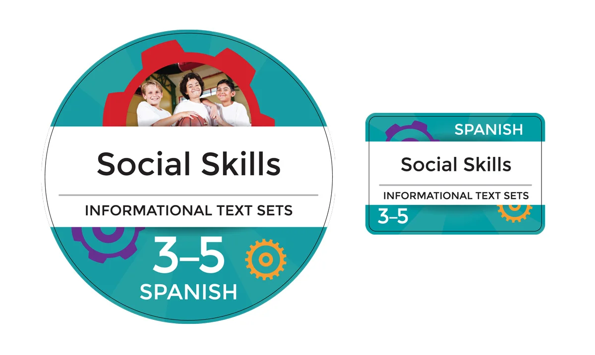
This is a sample of the stickers for the box that I designed. The circle one goes on the top and the smaller one goes on the front of the box on the lip that holds the books in. There were a total of 24 different stickers that needed to be designed.
This design was super challenging, making sure all the lines lined up after the box was put together. I really enjoy working out these types of challenges.


